
Every BRAND needs a bold logo refresh from time to time.
DePonte Cellars hit a home run with this simple, elegant rebrand. We work with many designers and brand owners and getting this right is not easy, but it is critically important to keep your products relevant to your consumers. The brand is built around their bold logo. This winery was a good customer years ago, but left us for a time for a California label printer. Now that we have the equipment and skill to handle their labels, they were happy to return. Learn more about Deponte by clicking here. This is similar to the recent update by Cascade Brewing, featured in this post.
Bold Logo Up Front
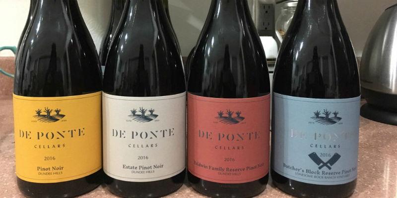
The main consistent element of this rebrand is the logo type. This bold, distinctive stylized type is the focal point on all the labels. This brand mark – to me – shows a solid, established, and durable brand. It is not rough, but it is bold and clean.
Color to Differentiate
Color sells. Powerful color statements attract the consumers’ eye and make your product stand out on the shelf. In this case, we did press proofs with several variations of each color so they could dial in their vision. With the power of digital printing, it is easy to provide printed press samples on the exact label material for an affordable price. This helps reduce the chance for error on the final run. The colors also make a clear distinction between the different varietals. Nobody will mistake one for the other, but with the prominent logo font, it is easy to see that they are one product family.
Fancy Foils and Papers
While still keeping the cohesive look, Deponte was able to elevate a few of the items to make them stand out. One (not pictured above) was even printed on a different, pearlescent material to highlight their top offering. All items have a clear foil stamp over the logo to give texture and visual contrast, but a few were substituted with silver foil to stand out. Again, the product family remains intact but certain items can still be set apart in their own way.
Backed By Great Service
Because this is the first printing, there were logistical and timing challenges. Holidays, illness, and even mechanical equipment breakdowns all complicated this print job, but we went the extra mile to make the customer happy – delivering on a Sunday, 2 days before the bottling truck arrived. We had a crew in on Saturday to finish the job, but the results made it all worthwhile. Thanks Deponte Cellars for trusting us with this important project. Cheers!


